

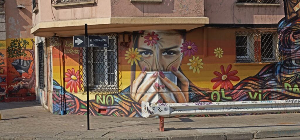
Color: Barrio Franklin, a vibrant neighborhood in southern Santiago, Chile, has become a hub for street art, attracting artists and muralists. Home to the famous Mercado Persa Biobío flea market and the culturally rich Mercado Persa Víctor Manuel—where the documentary Chile Style was filmed—this historically commercial area is now a thriving artistic and cultural center. Known as “the antiques warehouse,” it hosts concerts, fairs, and outdoor events, making it a dynamic space for creativity and community engagement.

2. TYPHOGRAPHY: This typographic image creatively forms the shape of a Starbucks cup with a straw using various words and phrases related to coffee, taste, and Starbucks culture, such as “CREAMY,” “DISCOVER,” “STARBUCKS,” “RICH,” “SMOOTH,” and “TASTE.” Set against a deep red background, the white text stands out, varying in size and orientation to enhance visual appeal while maintaining the recognizable cup silhouette. The Starbucks logo appears on the right alongside the phrase “STARBUCKS A NEW TASTE,” reinforcing the brand’s identity. This design effectively merges typography and branding into a visually striking promotional piece.
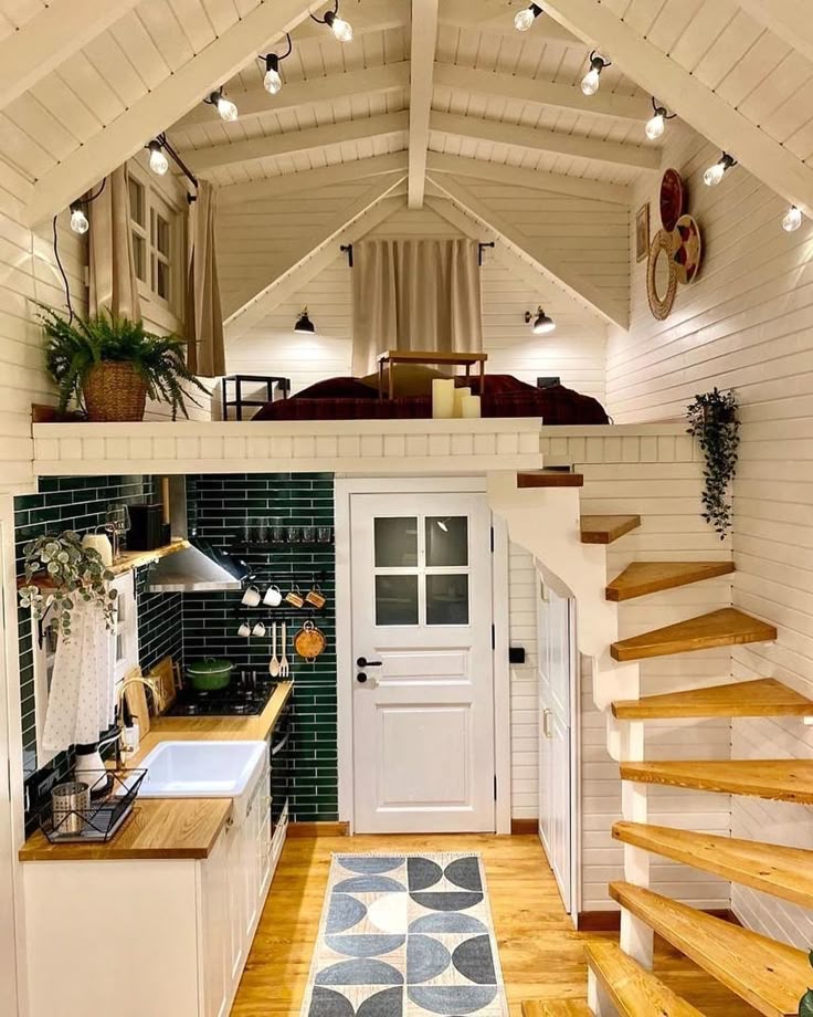
MINIMALISM & USE OF SPACE: This image beautifully exemplifies minimalism and efficient use of space, featuring a compact yet highly functional loft-style interior. The design embraces a clean, white aesthetic with wooden accents, creating a warm and inviting atmosphere. The open-concept kitchen utilizes sleek cabinetry, open shelves, and wall-mounted hooks to maximize storage without clutter. A lofted sleeping area above the kitchen optimizes vertical space, accessed by a floating wooden staircase that adds to the minimalist charm. Thoughtful lighting, natural textures, and strategic decor elements enhance the sense of spaciousness while maintaining a cozy, uncluttered feel, making the most of every inch in a stylish and practical manner.
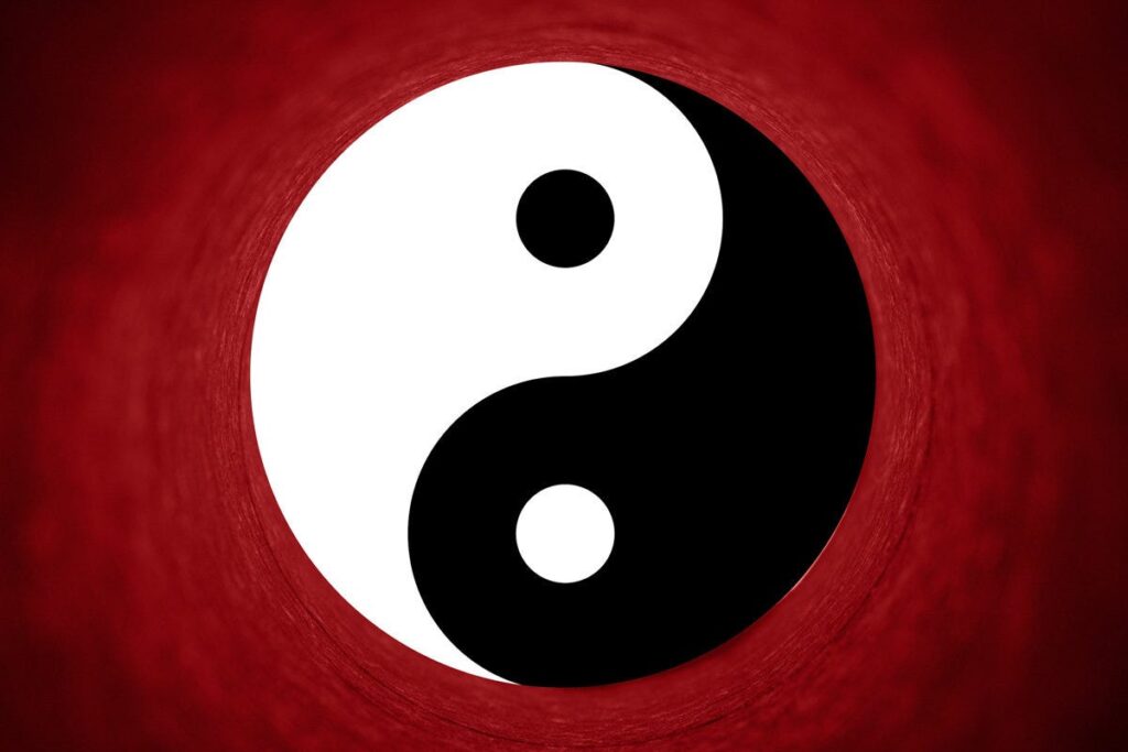
BALANCE: The balance of Yin and Yang represents the dynamic equilibrium between opposing but complementary forces in the universe. Yin embodies qualities such as darkness, femininity, passivity, and receptivity, while Yang represents light, masculinity, activity, and assertiveness. Rather than being in conflict, these forces coexist in a harmonious cycle, constantly flowing into and influencing one another. This duality is symbolized by the Taijitu (Yin-Yang symbol), where each side contains a dot of the other, signifying that within darkness there is light, and within light there is darkness. Achieving balance between Yin and Yang is essential for harmony in nature, relationships, and personal well-being, as neither force can exist without the other.
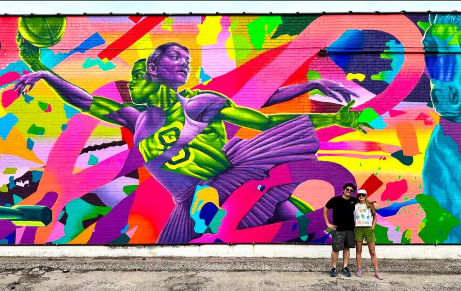
UNITY: This picture represent a poem written beautifully captures the essence of unity as a powerful force that binds people together, transcending differences in culture, background, and experiences. It emphasizes that strength lies in diversity and that unity fosters peace, harmony, and prosperity. By standing together against hate and division, humanity can build a brighter future filled with hope and solidarity. The poem serves as a heartfelt call to embrace togetherness, recognizing that collective strength leads to lasting progress and a better world for all.
CONCLUSION
This Design Safari has provided me with profound insights into the manifestation of essential design principles in everyday items and settings. Each photograph I captured not only illustrates these principles but also deepens my understanding of the impact of design on our perceptions and interactions. By persistently look around and thinking about our surroundings, we can refine our design sensibilities and appreciate the art of visual communication.